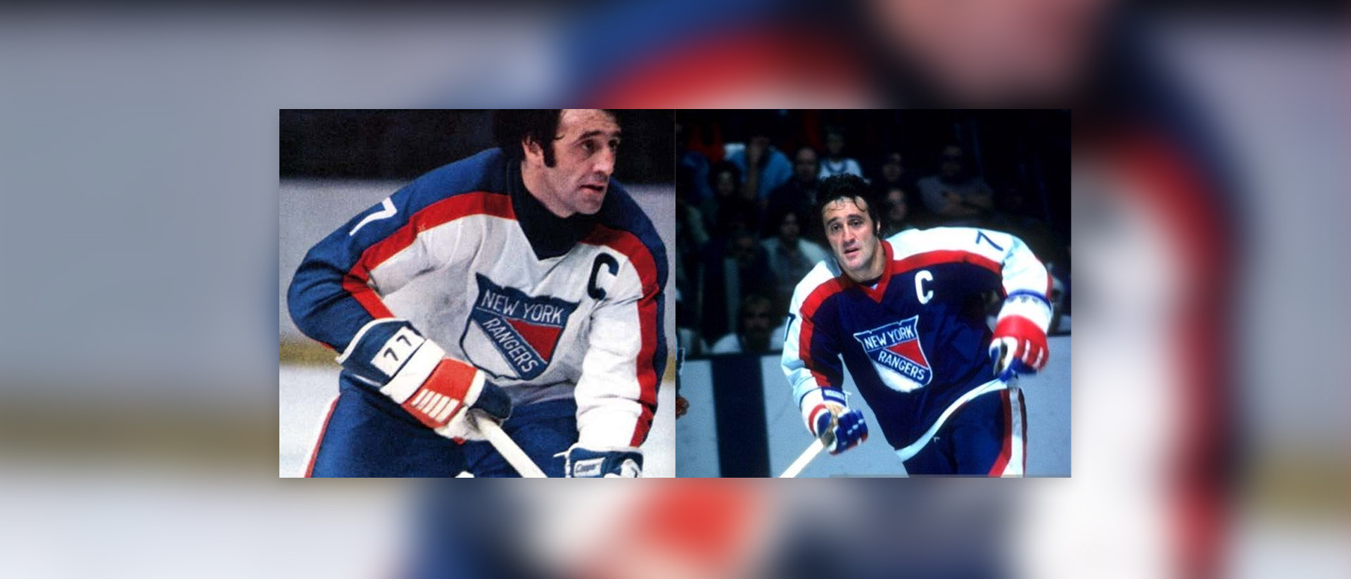
The New York Rangers have one of the best, and most iconic jerseys in the entire NHL. But have they always worn great jerseys? Well not exactly.
Enter the 1976 New York Rangers jerseys, that i've affectionately dubbed The Pajama Jerseys
due to how much they look like literal pajamas.
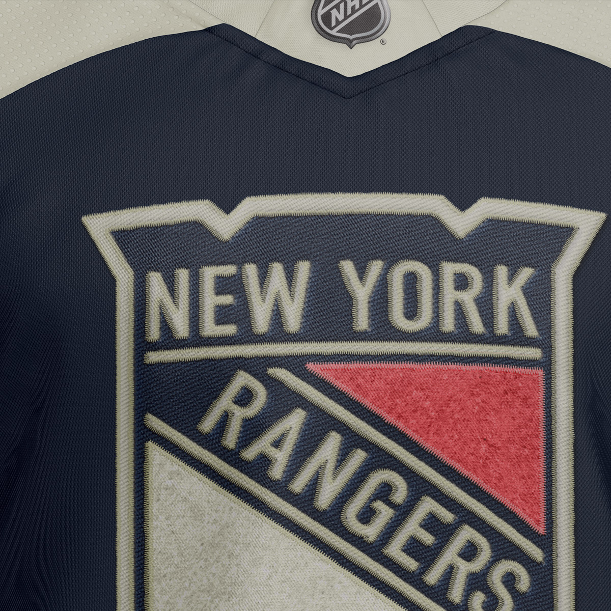
The Rangers also have one of the best logos in all of sports, but why does it look so weird on jerseys? It's just never worked.
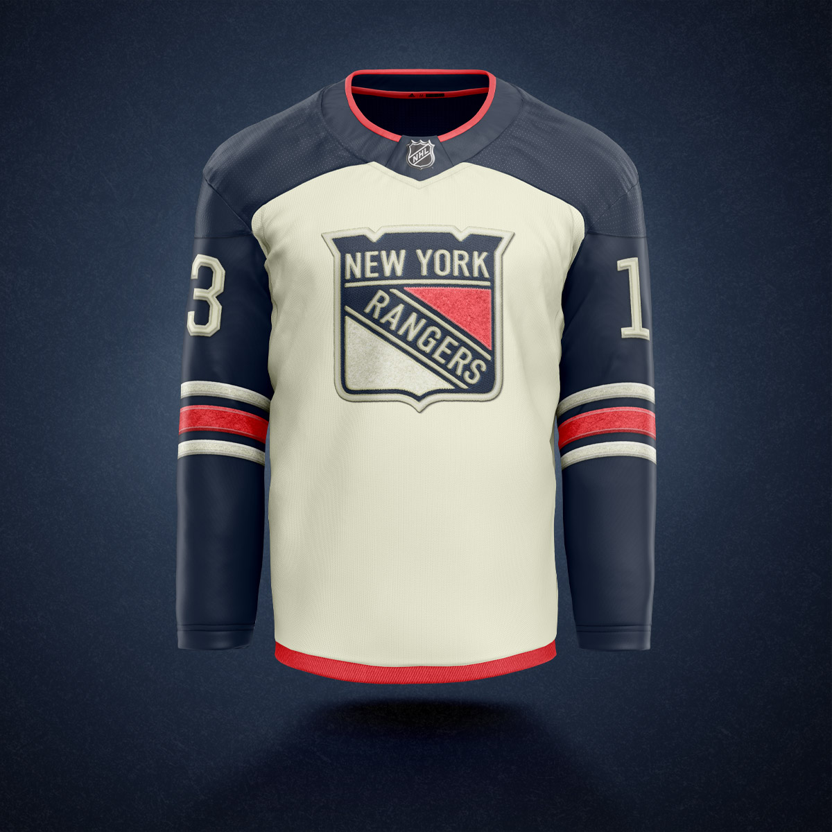
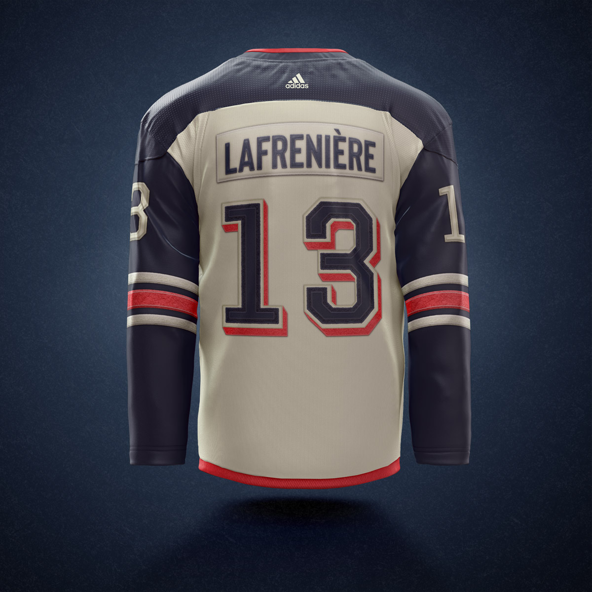
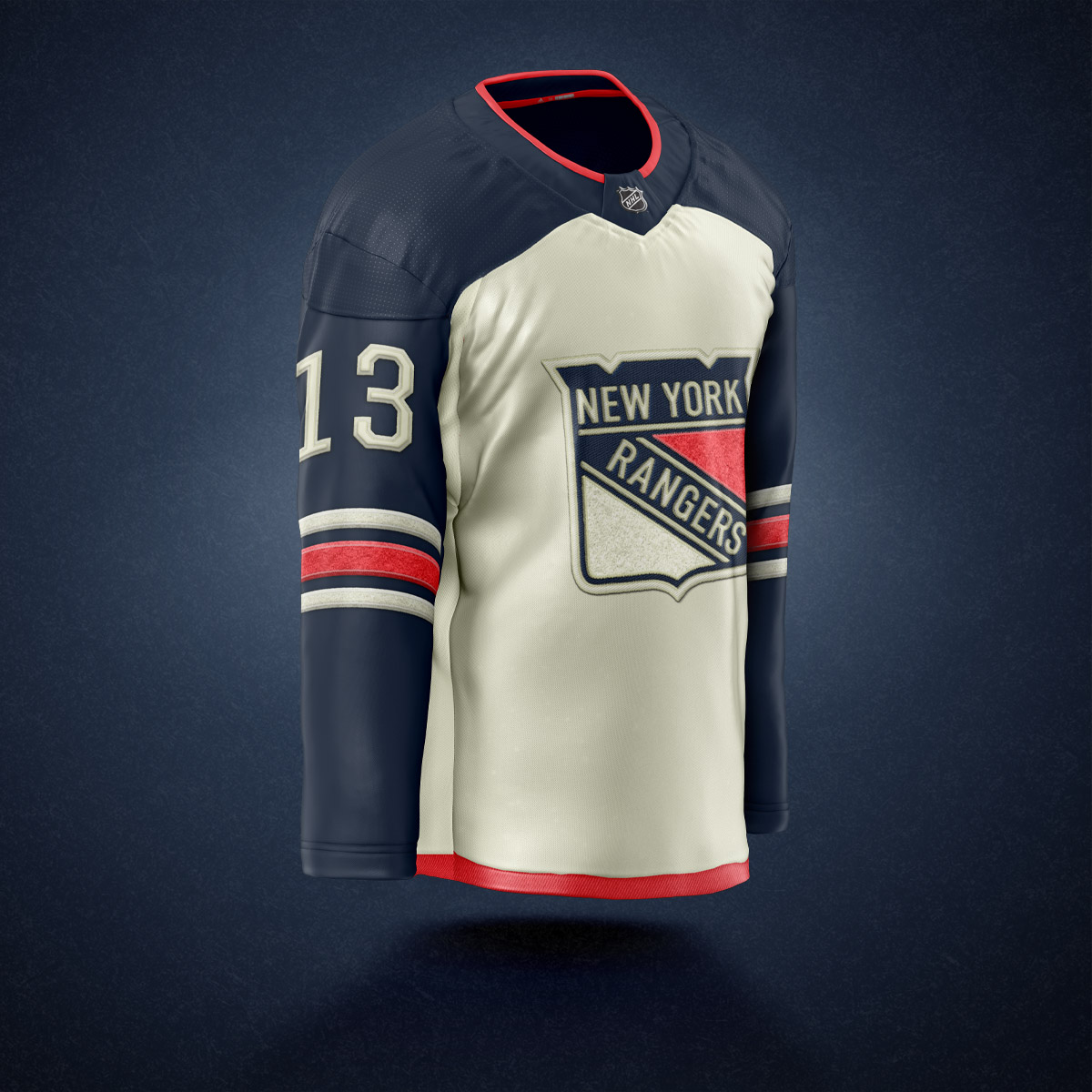
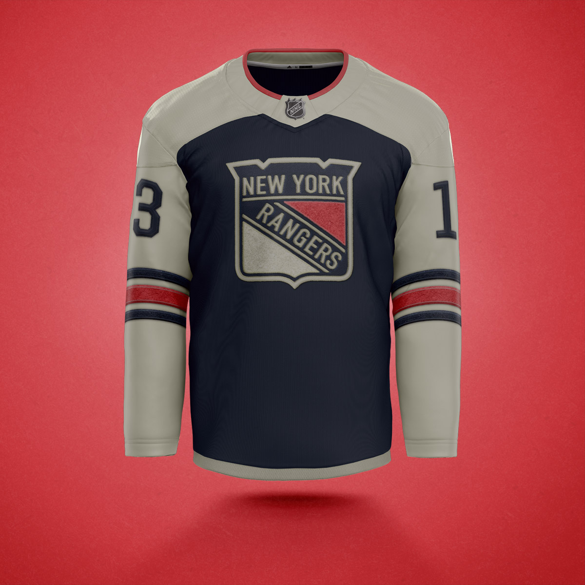
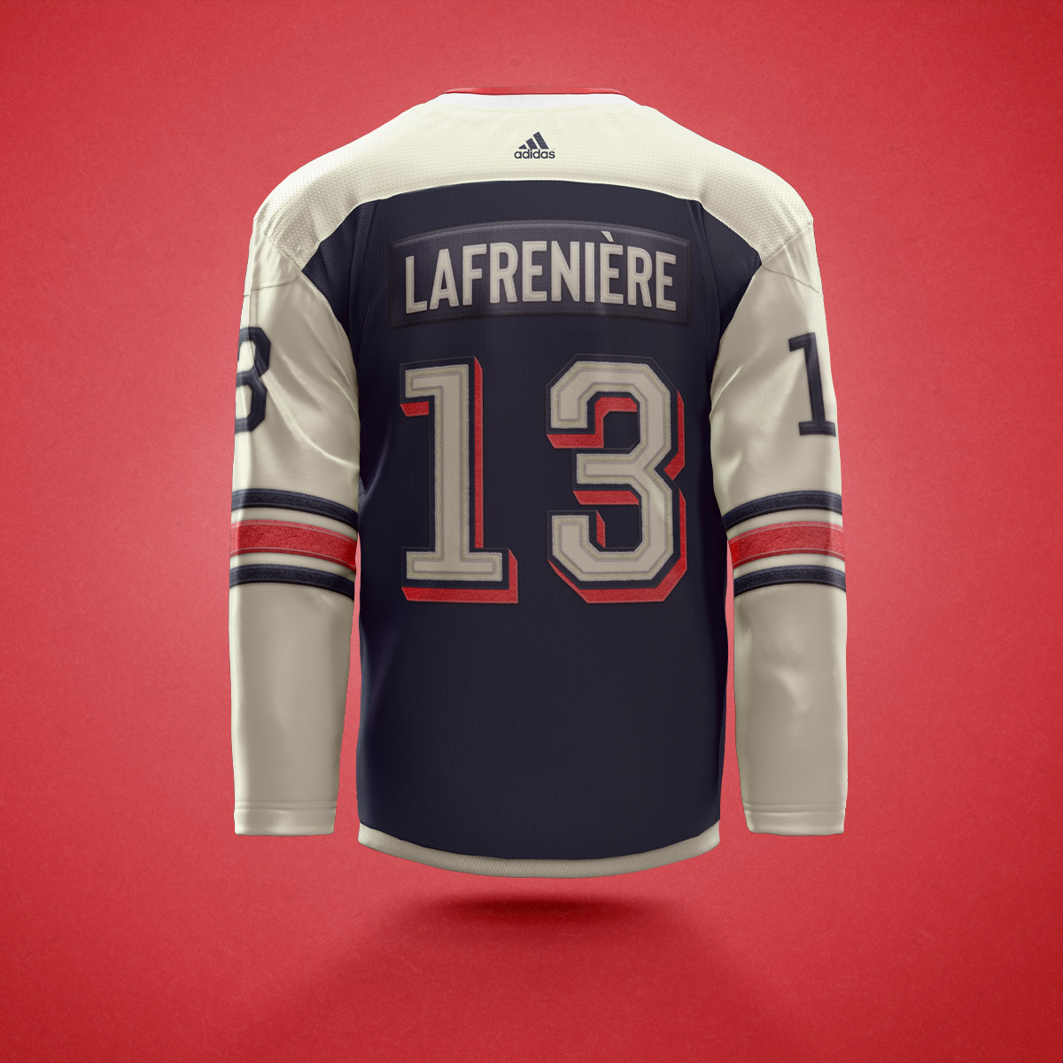
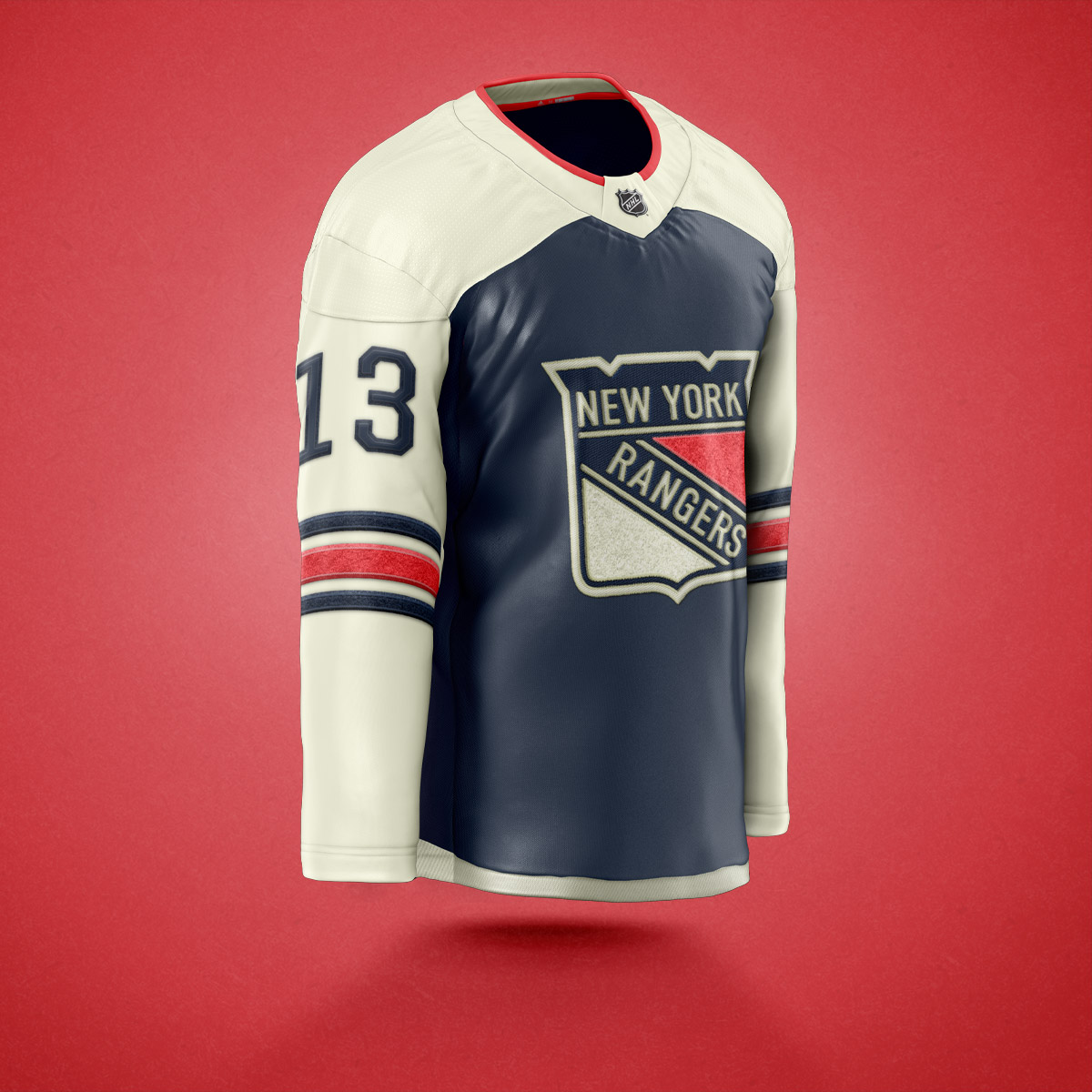
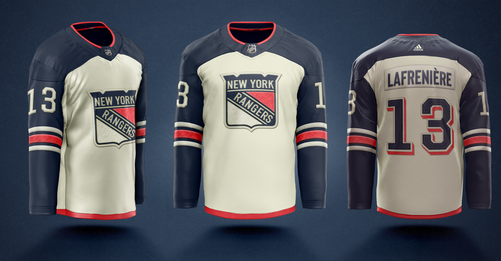
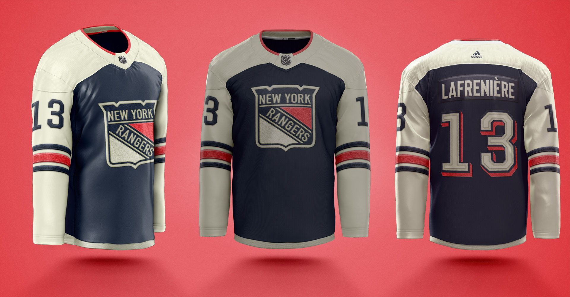
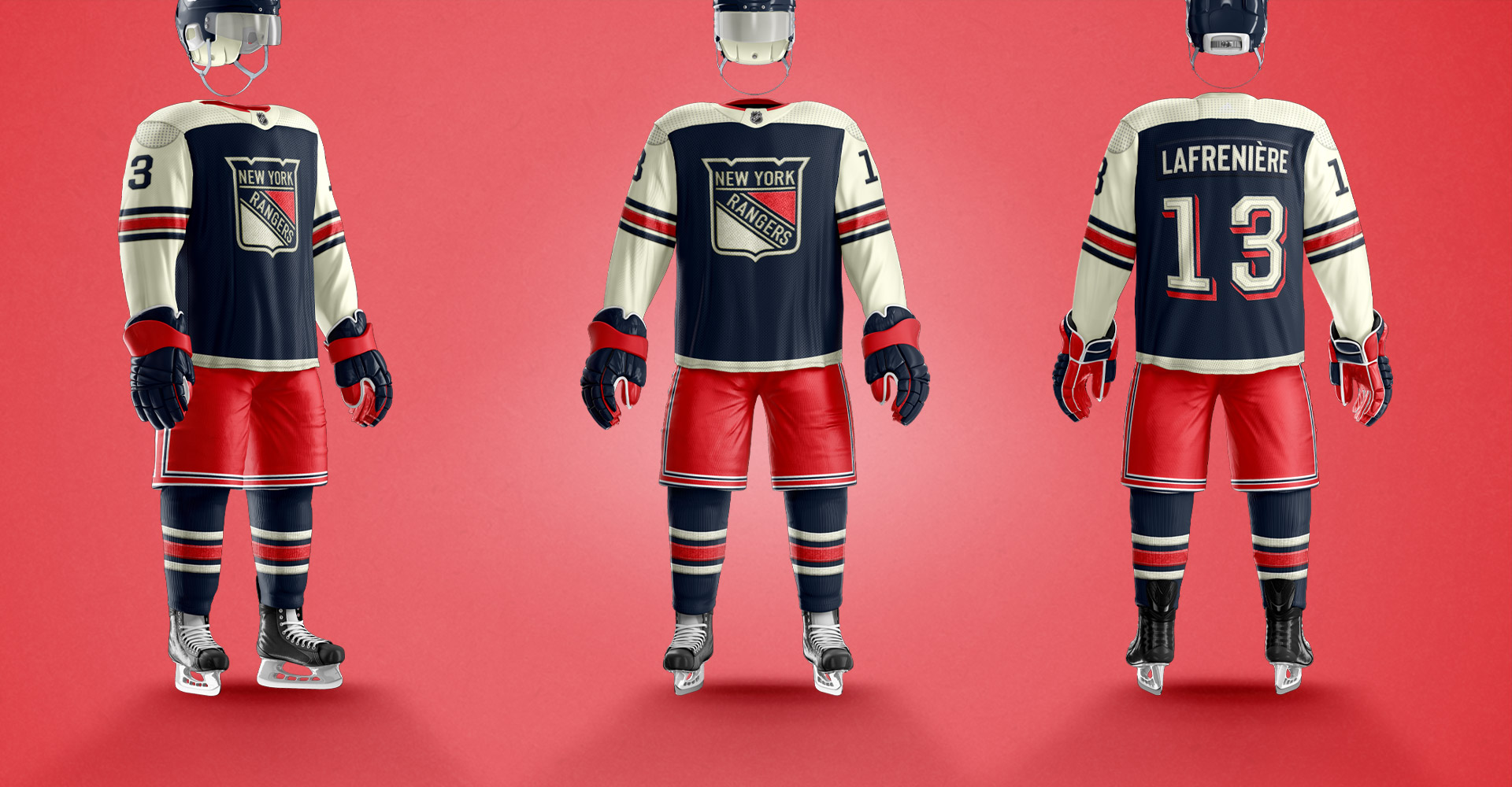
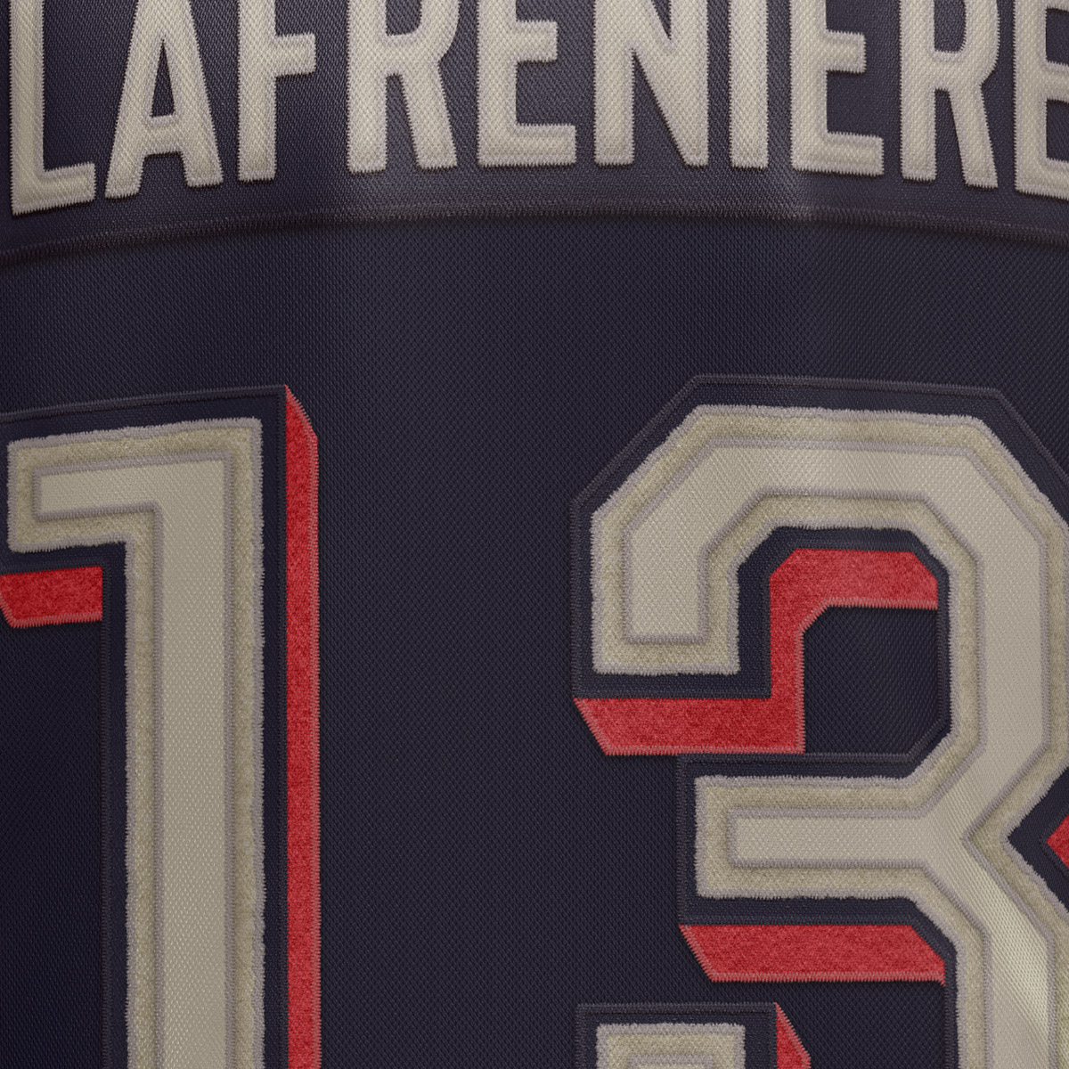
I took a chance at redesigning and simplifying these awful jerseys as a new alternate set for the Rangers. Swapping the royal blue for the navy blue they historically use for alternate jerseys.
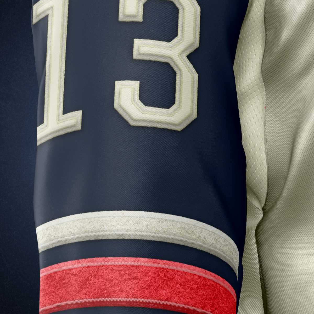
The first thing to go for me, was the weird shoulder and sleeve striping. Making the sleeves fully the color instead of the awkward half sleeve striping, and adding the rangers traditional striping pattern to the sleeves.
I think this is a successful reimagining and cleaning up of these jerseys. But does the logo look right on them? That's up to you.
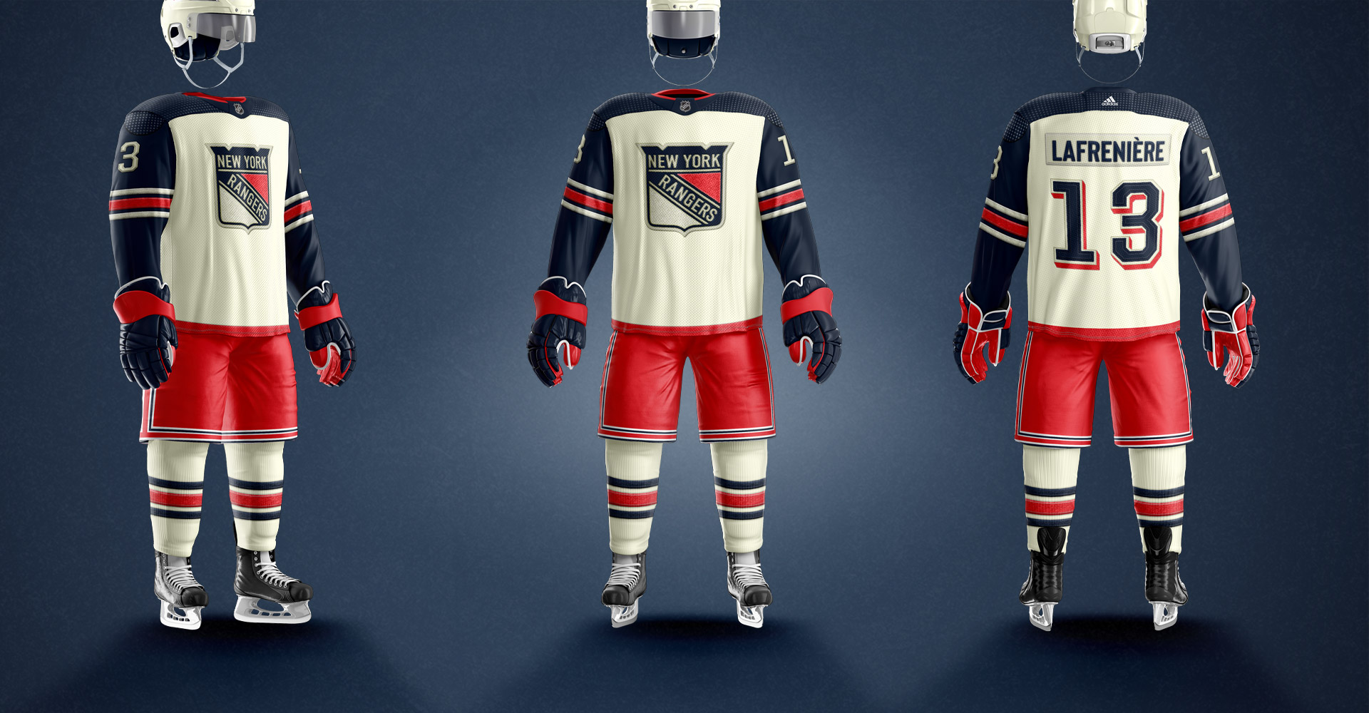
First, here is a quick look at the jerseys I'm trying to redesign