The New York Rangers Lady Liberty Jerseys are so bad they're good, full stop.
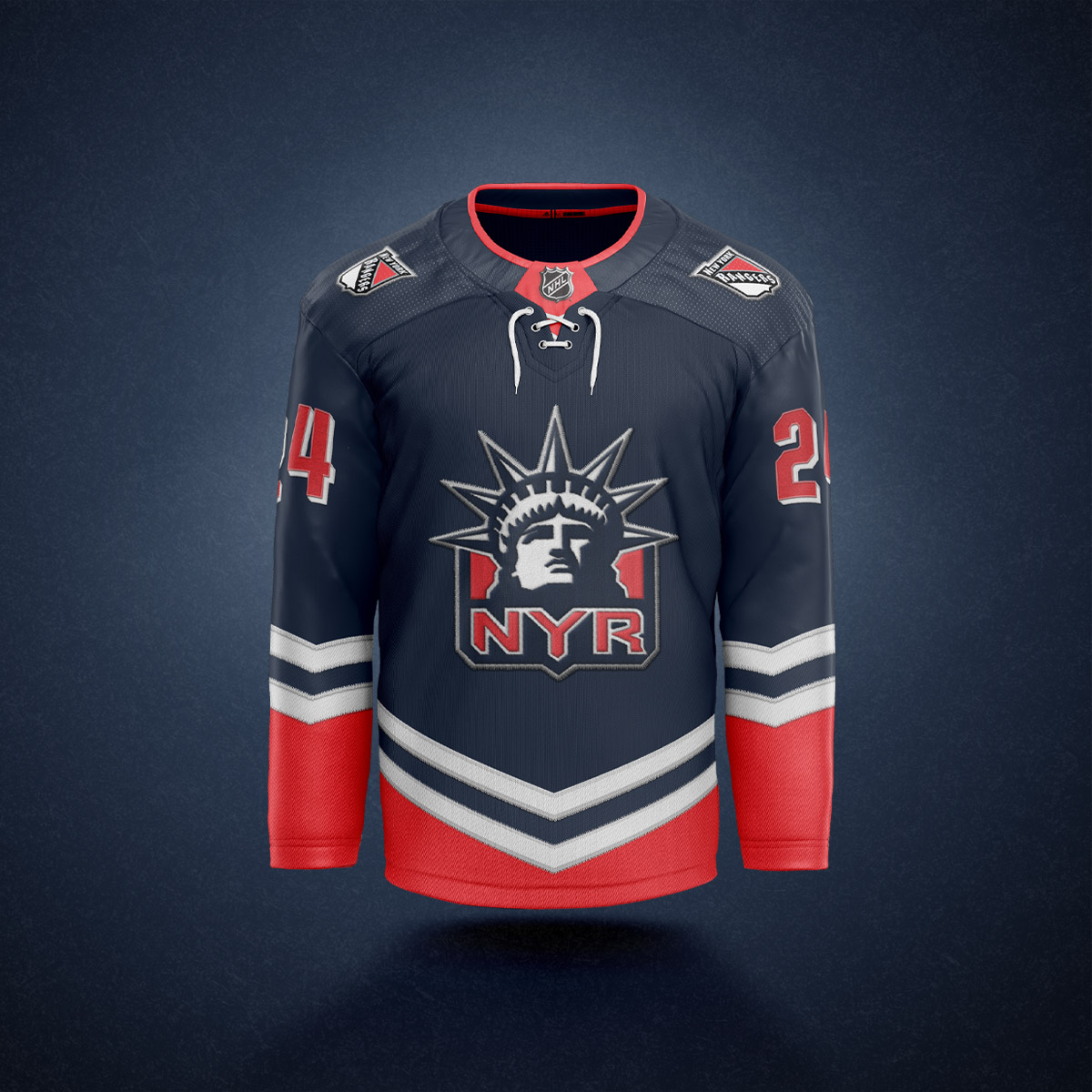
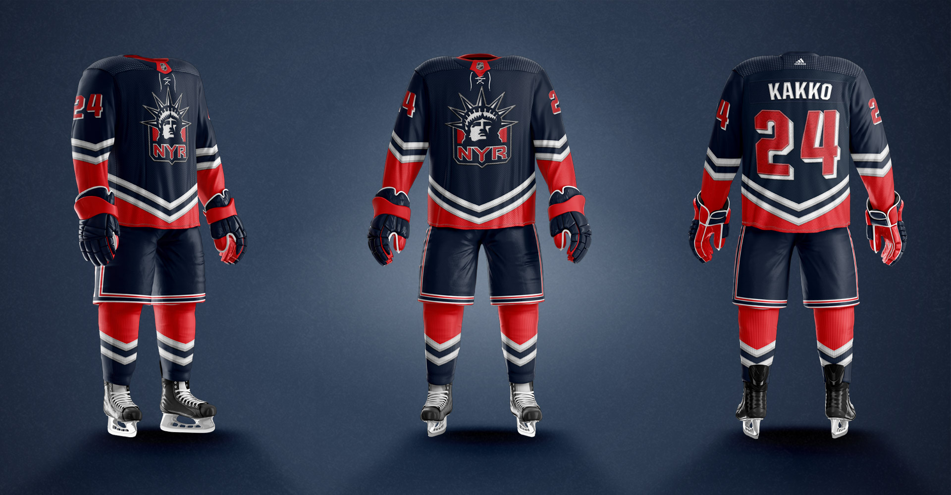
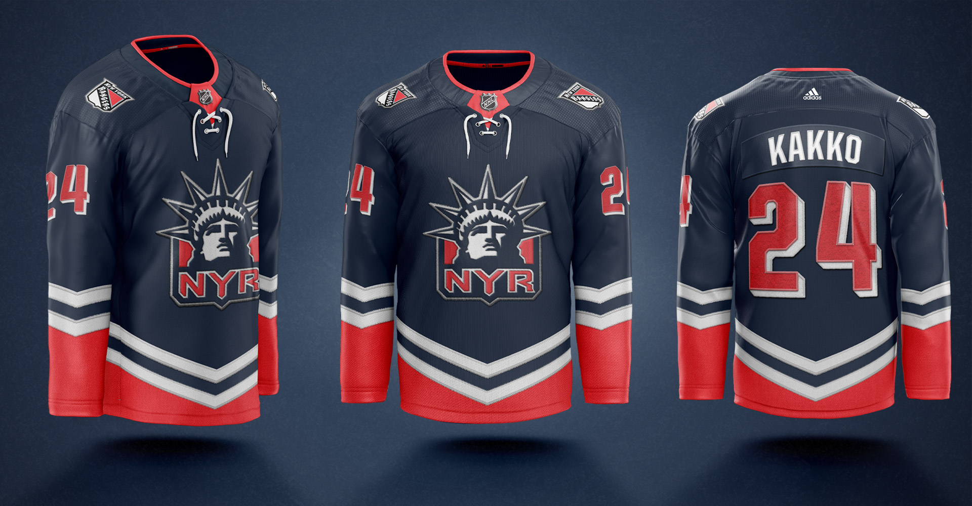
I love them so much that I wanted to take a shot at updating them. The original jerseys featured sharp angled chevron style striping on the arms, but nothing on the bottom of the jersey leaving the front feeling very empty and looking almost pajamalike. I was also never a big fan of including gray/ silver as an extra color.
I figured, if you're going to get goofy, why not go full goofy?
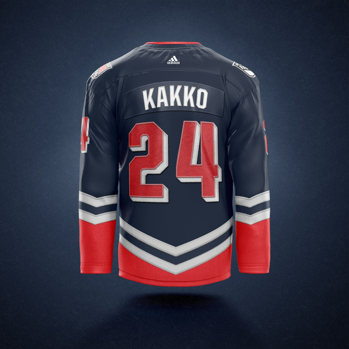
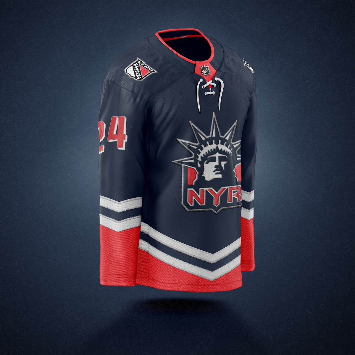
I doubled down on the angled striping adding the pattern to the bottom of the jersey as well, doing away with the grey color in the original jerseys.
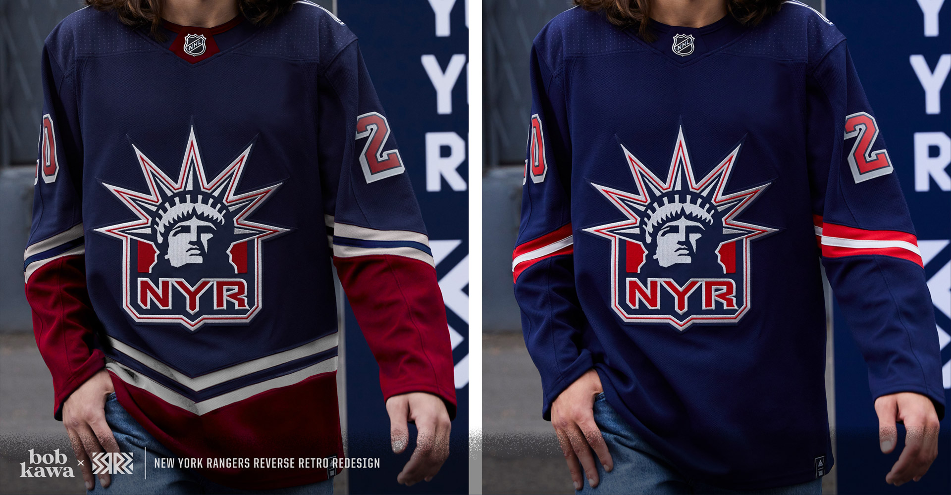
The andgled red striping on the bottom of the jersey did present one problem, it made the classic NYR red pants look very silly, so I ditched them in favor of a navy color. This may be sacrilegious to most Rangers fans, but isn't the point of a third jersey supposed to be having something different and unique? Too many Rangers fans are unwelcoming of anything that deviates from what they're used to.
I on the other hand thing that hockey should be fun, and these jerseys are fun.